A Better Architecture Website Starts with the Project Story
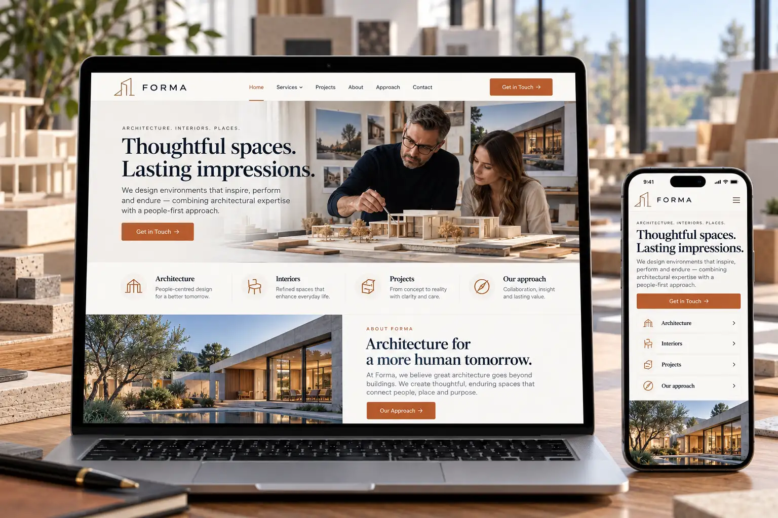
An architecture website has to do two jobs at once: communicate the character of the work and help a potential client decide whether to start a conversation. A dramatic photograph can support the first job. The project story supports the second.
A useful redesign brief brings the two together before choosing transitions, typefaces or a new grid. Here is a practical way to make an architecture portfolio more informative without losing its visual confidence.
Organise projects around a decision
A visitor may be comparing residential practices, looking for commercial experience or trying to understand how the team handles an unfamiliar site. Give them a useful way into the work. Project type, scope and context often say more than a sequence of unexplained photographs.
Choose filters only when they help someone narrow a real choice. A small portfolio may work better as a carefully ordered set of projects than as a complicated search interface. Keep the project names readable on a phone and avoid hiding essential information behind hover effects.
Explain the challenge before the gallery
Introduce a project with the situation the design needed to address. Describe the brief, the constraints and the team's role in plain language. Then let the imagery show how those decisions became a building or an interior.
For example, an illustrative renovation concept could explain how the layout brings daylight into a narrow space. That gives a reader something specific to look for in the photographs. It is more useful than an unsupported claim that every project is exceptional.
Give photography enough room
Plan wide views, details and portrait crops as part of the page rather than squeezing every image into one identical ratio. Check the order on mobile. A beautiful desktop sequence can become a long, repetitive scroll on a smaller screen.
Keep captions close to the relevant image. Confirm credits and publication permissions before using real project photography. If a visual is a concept or a render, label it accurately so a potential client understands what they are seeing.
Connect the work to the next step
After the project, explain the relevant service and offer a clear contact route. Ask for enough information to begin a useful conversation: project type, approximate location and the visitor's current stage may be more helpful than a long compulsory questionnaire.
Before approval, ask someone outside the studio to find a relevant project and explain what the practice contributed. Then ask them how they would enquire. Their hesitation will show where the page needs clearer context.
A cinematic architecture website should make the work easier to understand as well as more memorable. At Cinematic Web Design, we bring visual direction and the business journey into the same design brief.
Explore the approach: Cinematic Web Design
Illustrative examples in this article are design concepts, not client case studies.
For a related project brief, explore our approach to cinematic website experiences at Cinematic Web Design.

Comments
Post a Comment